
Why Are Different Colors Used to Distinguish Detectable Warning Tiles?
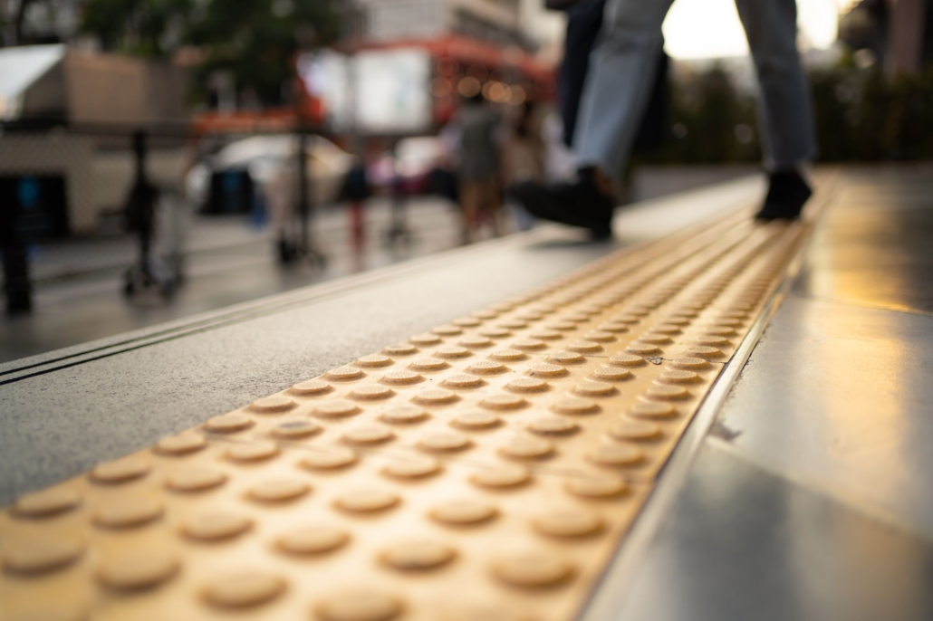
Detectable warning surfaces are one of many requirements set by the Americans with Disabilities Act (ADA). They help people with visual impairments identify transitions between sidewalks and roadways, the tops and bottoms of ramps, and the edges of transit platforms. The ADA sets guidelines on detectable warning surface colors, the size of warning tiles, and dimensions and placement of truncated domes.
The ADA requires these visual contrasts between detectable warning tiles and adjacent surfaces:
- Light tiles against darker surfaces
- Dark tiles against lighter surfaces
However, ADA regulations don’t set a specific color requirement. So long as the colors contrast with surrounding areas, any color or combination of colors can be selected. Businesses, municipalities, and other entities may set their own rules. For example, California requires warning surfaces to be yellow. In New York City, gray has traditionally been the color of choice, although safety-red is becoming more commonplace in New York and New Jersey.
Contrasting color is important because it:
- Allows the visually impaired to notice the warning. A pedestrian may be legally blind or have depth perception issues; a highly contrasting color lets them know the raised domes are there and to be cautious when proceeding beyond the warning surface.
- Contrasts with other surfaces. A community may use different colors of cement, such as a lighter cement around the perimeter of a park. An alternative to yellow may be used to help pedestrians navigate to and from the park at nearby crosswalks.
- Helps meet Americans with Disability Act Accessibility Guidelines (ADAAG). The ADAAG suggests, but does not require, a 70% light reflectance value or higher for the visually impaired. Depending on the color combination, 60% to 70% light reflectance can suffice.
- What is light reflectance value (LRV)? A contrast percentage is obtained by dividing the LRV of a lighter area by the LRV of a darker area and multiplying the answer by 100. Concrete is generally rated LRV 50 while cast iron is typically around LRV 11; this exceeds the 70% threshold—LRV ranges from zero or black to 100 or pure white.
- Stands out to individuals using their phones. People who make calls, text, or use social media are alerted they’re approaching a transition to a potentially hazardous area. Pedestrian fatalities due to motor vehicle accidents have been on the rise in recent years.
The Most Common Detectable Warning Surface Colors
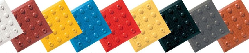
Colors often used for warning tiles include:
- Yellow: This is effective at catching the attention of the human eye and provides strong contrast with surrounding surfaces. Yellow is also a color that signifies caution.
- Red: Red universally implies “stop.” It contrasts well with light concrete. In some states, regulations require the use of red tactile warning surfaces for controlled pedestrian walkways or crossings, such as those near major intersections or on pedestrian bridges.
- Dark Red: This creates a brick-like appearance on a path. It is sometimes a design choice in areas where asphalt or concrete is lightly colored; in this case, it will meet ADA contrast requirements.
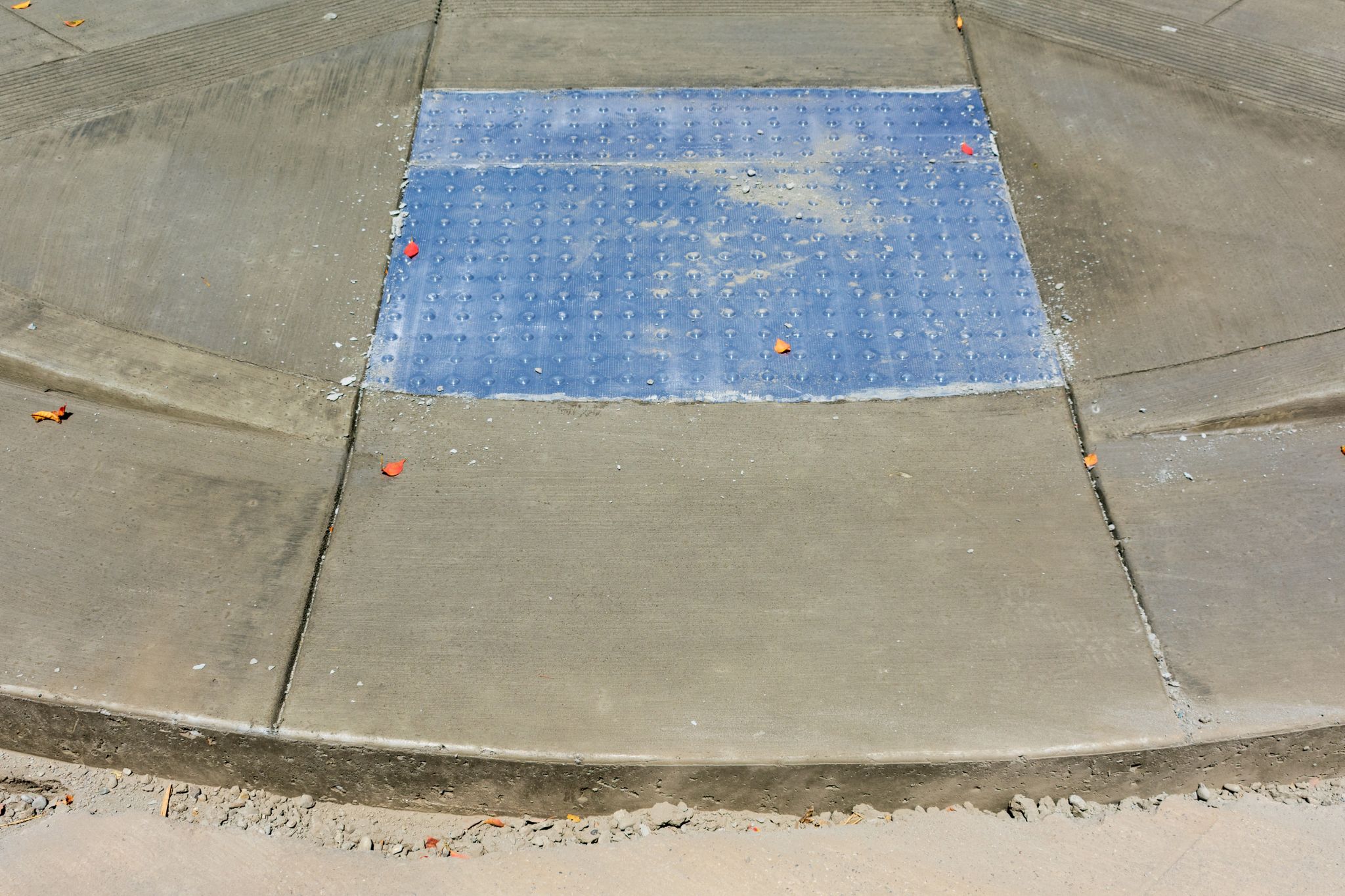
- Blue: A bright blue paint is often used for warning surfaces in handicap-accessible areas. Blue tiles often have wheelchair symbols painted on the surface in white.
- White/Light Gray: These may be used for detectable warning tiles placed on or near roads or paths made of dark-colored asphalt.
Orange-red, clay red, brown, dark gray, and black may be used for truncated dome tiles as well. Often, the choice of color is tied to aesthetics rather than purpose. The United States Access Board conducted a study in 2007 of tile colors and found that traditional yellow and brick red provided an equal level of contrast. In areas where a single color doesn’t provide adequate contrast, it found using multiple colors was beneficial. One color could be used as a border around a second color, as is often done at rail stations.
The Use of Custom Colors
There’s generally no limit as to what colors and shades are used, aside from federal requirements for contrast and any applicable state mandates. A business may use custom colors to reflect its brand. For example, an arena may use team colors for detectable warning surfaces, or a retail store may use tiles with different colors, images, and logos for specific seasons or holidays.
Beyond Detectable Warning Surface Colors
Color isn’t the only factor in making tactile walking surfaces more noticeable. Photoluminescent walking surfaces made by ADA Solutions emit light even when sources of electricity aren’t available. A product called Glow-Dome™ is suited for emergency situations such as power failures in pedestrian areas, as well as in train stations. The product is charged by ambient light and requires no power source; it is available in paver tiles and in a replaceable or retrofitted transit format.
ADA Solutions also offers replaceable graphic tile systems. They can feature messages, different fonts, and reflective ink in up to four colors. A custom message can be fit on one tile or be placed across multiple sequential tiles. All custom panels feature ADA-compliant, slip-resistant truncated domes.
Contact ADA Solutions
ADA Solutions manufactures and supplies truncated dome, Directional Bar, and Guide Surface
Tiles. Our Cast-in-Place replaceable panels for fresh concrete and surface applied detectable warning panels suited for new construction or retrofits meet the latest ADAAG requirements. We can provide our products in all common detectable warning surface colors.
Continue browsing our online resources to learn more about our detectable warning products. Feel free to call us at 800-372-0519 for additional help or to request a free quote online today.

