
Why Certain Colors Are Used for Tactile Detectable Warning Surfaces

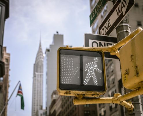
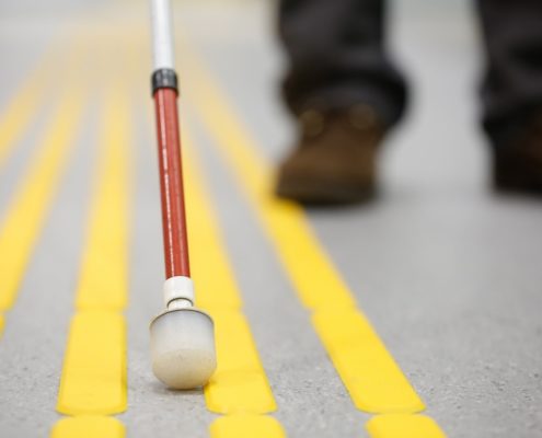
Have you ever wondered what purpose those raised truncated domes served when placed at busy intersections or along the edge of subway and train platforms? Aside from providing visual cues to non-visually impaired people that they need to take caution in this location, the raised bumps help provide non-visual cues to people who have problems seeing.
They could have reduced vision, be considered legally blind, or have other vision problems relating to depth perception. When they “feel” the raised bumps on the surface, it alerts them that they need to take precautions beyond the end of the raised domes.
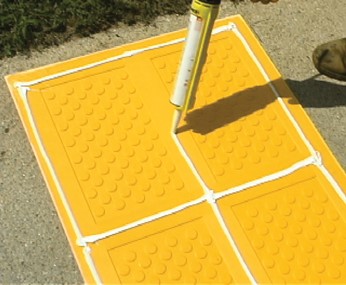
Detectable warning surfaces are available in a variety of shapes, sizes, and styles, depending on where they will be installed. In addition, they are offered in a wide array of different colors. Most people are familiar with the bright-yellow-colored warning surfaces since this is one of the most used colors.
Yet, you may have encountered tactile surfaces that are blue, red, black, white, or a combination of two or more colors. There are even graphic-style warning surfaces that could feature a company’s brand name, logo, or other such advertisements.
Why Are There Different Colors?
The ADA (Americans with Disabilities Act) does not have a set color requirement for tactile raised warning systems. According to Section 705.1.3 of the ADA, it states the following in regards to color:
“Detectable warning surfaces shall contrast visually with adjacent walking surfaces either light-on-dark or dark-on-light.1”
What this means is that municipalities, businesses, and other parties are responsible for ensuring tactile warning surfaces are installed where required by federal laws, and that they are essentially free to choose any color or combination of colors they desire, so long as the colors contrast with the surrounding surfaces.
To illustrate, a local community is building a new park that has a sidewalk around its perimeter which serves as a crosswalk at busy intersections. The streets and sidewalks are made of light-colored cement.
At each intersection, the color of the warning surfaces should be a dark color to contrast with the light cement. The local community could decide to use the traditional yellow or opt for a dark red, blue, or some other color if they so desired.
However, before you start ordering new colors for the tactile dome surfaces you are responsible for, you do need to check your state’s regulations and requirements. Some states like California, have adapted their own specific regulations and requirements in regards to color. In California, the state’s regulations allow for the use of yellow-colored warning surfaces.
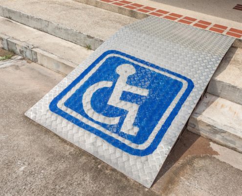
If the warning surfaces you are responsible for are in California, then yellow is currently the only color you are allowed to use with a few exceptions. For example, you might be allowed to add white text or an image to the surface, such as the wheelchair used for handicap accessible parking spaces.
However, it is your responsibility to ensure this is allowed in the locations where you are going to be installing new or replacing existing warning surfaces.
What Is the Role/Purpose of Each Color?
The color of truncated domes can sometimes be used to serve specific roles or purposes. With our traditional yellow color, it signifies to use caution in the location. In some cities, they will also use a bright red or brick red color, which also indicates people should use caution.
Some state regulations will only allow the use of red warning surfaces in areas that are considered a controlled pedestrian walkway or crossing. A controlled walkway or crossing would be considered crosswalks at major intersections, but could also include different types of crossings, like a pedestrian bridge used above a busy road.
The bright blue color that is often associated with handicap accessible areas is typically reserved for the same purposes when used with warning surfaces. You may also notice the wheelchair symbol in white on the surface.
 Other colors you can encounter in different cities could include:
- Black
- Dark Red/Brick Red/Orange-Red
- Dark Gray
- White
- Light Gray
- Brown/Clay Red
- Light Yellow
The use of these colors is often for aesthetic reasons and, typically, does not have any specific role or purpose tied to the color. For example, dark-red warning surfaces may be used on a pedestrian crossing that intersects a jogging and bike path made of a light-colored cement or paving tiles.
The dark red provides a brick-like appearance to the path and satisfies the ADA contrast requirements. On the other hand, if the path was dark-colored asphalt, then the warning surface tiles should be a light color, so white or light gray would both work as viable color choices.
Can a Business Use Custom Colors?
As long as there are no state-mandated requirements and the tactile system satisfies the ADA federal requirements, then by all means, a business can use custom colors. Custom colors can include just about any color and shade. For instance, a sports arena may choose to install detectable tactile surfaces that reflect the team’s colors.
Some businesses also use custom designed panels that they can change out that feature to different types of images, logos, and text. For example, a retail store could have special tiles made to reflect various times of the year, holidays, or seasonal sales events. As long as the panel they want to replace is a cast-in-place replaceable panel, they can swap it out with whatever custom designed panel they want to use.
Does the Choice of Color Really Matter?
 According to a study conducted by the United States Access Board, it found that while traditional yellow was a good contrasting color for many applications, unless there were state regulations requiring the use of this color, other colors would work just as well.
In fact, they found brick red to be just as superior a contrasting color to yellow in their 2007 research study.2 The study also found that the use of multiple colors in areas where using a single contrasting color was difficult was better compared to using a single color.
To illustrate, a rail station platform uses a series of different paver tiles in both dark and light colors. Since there are both light and dark colors, choosing a contrasting color to satisfy the ADA requirements could prove challenging. However, the ADA does allow an exception where you could use two colors—one as a border around the second color to help create the necessary contrast.
How ADA Solutions Can Help
ADA Solutions offers a wide array of tactile warning systems and solutions in traditional yellow and customizable colors to suit your needs and requirements. We can lend our expertise to help ensure you satisfy ADA requirement and any state regulations for the type of panels you choose for your project including:
- Cast-in-Place
- Cast-in-Place Replaceable
- Photoluminescent Systems
- Way-Finding Surfaces
- Replaceable Graphic Tile Systems
- Radius Systems
- Surface Applied Systems
- Cast Iron Tactile Systems
We are committed to the highest quality and standards in our products and solutions. Over the years, we have installed over 30 million square feet of warning surfaces all across the country! At ADA Solutions, your project and your needs always come first to ensure you receive the customer-focused attention you deserve.
We would also be happy to supply you with a sample of our products. To request a free quote, free sample, for assistance finding a distributor in your area, or any other questions about ADA Solutions truncated domes and warning systems, please feel free to contact us at (800) 372-0519 today!
Sources:


